A lead capture page, also called a splash page, sits between your prospect and your PDF document. Before viewers access your content, they provide their contact information through a simple form. This gate transforms anonymous document views into identifiable leads.
Use a lead capture page when sharing high-value documents: offering memorandums, product catalogs, pricing sheets, technical specifications, or proposals. Any PDF worth creating is worth knowing who reads it.
Components of an Effective Lead Capture Page
A lead capture page needs five elements working together:
Document preview or cover image. Show prospects what they're about to access. A thumbnail of the first page or a branded cover image creates visual context and increases form completion rates.
Brand-consistent design. Your splash page represents your company. Match colors, fonts, and visual style to your existing materials.
Clear call-to-action. "Submit," "Continue," or "Access Document", the button text matters less than its visibility.
Brief explanation. One or two sentences describing the document's value. Enough context to justify the form, not enough to replace reading the actual document.
The Math Behind Lead Capture Pages
Lead capture pages typically convert between 20% and 40% of visitors into identified leads. That means 60% to 80% of visitors leave without providing information.
This sounds like a problem. It isn't.
Prospects unwilling to share basic contact information rarely have buying intent. A commercial real estate investor serious about a property will provide an email address. A wholesaler evaluating your product catalog will fill out the form.
Lead Capture Page Templates
BridgePDF offers 8 layout templates for lead capture pages. Each serves different document types and brand styles.
Compact
A single centered card containing logo, title, document preview, and form in a vertically condensed format. Everything appears above the fold on most screens.
Works best for: Mobile-first audiences, quick-access documents, or any scenario prioritizing conversion speed over information depth.
Advantages: Mobile-friendly by design. Immediate form visibility maximize the conversion opportunity.
Limitations: Limited space for description or value proposition. Works best when document value is already understood by the recipient.
Elegant
A form-first design centered on the page. Logo and title sit above a clean form card with no document preview image. A subtle divider line adds visual refinement.
Works best for: Confidential documents, executive materials, or situations where the recipient already knows what they're accessing.
Advantages: Fastest path to conversion. No distractions between the prospect and the form. The elegant simplicity signals professionalism and respects the viewer's time.
Limitations: Provides no preview of document content. Inappropriate for cold outreach where prospects need convincing before providing information.
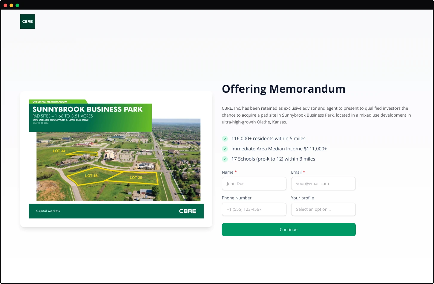
Hero
The document cover image dominates the left side of the page at full height. Logo sits in the top corner. Title appears above the hero image, with the form floating in a card on the right.
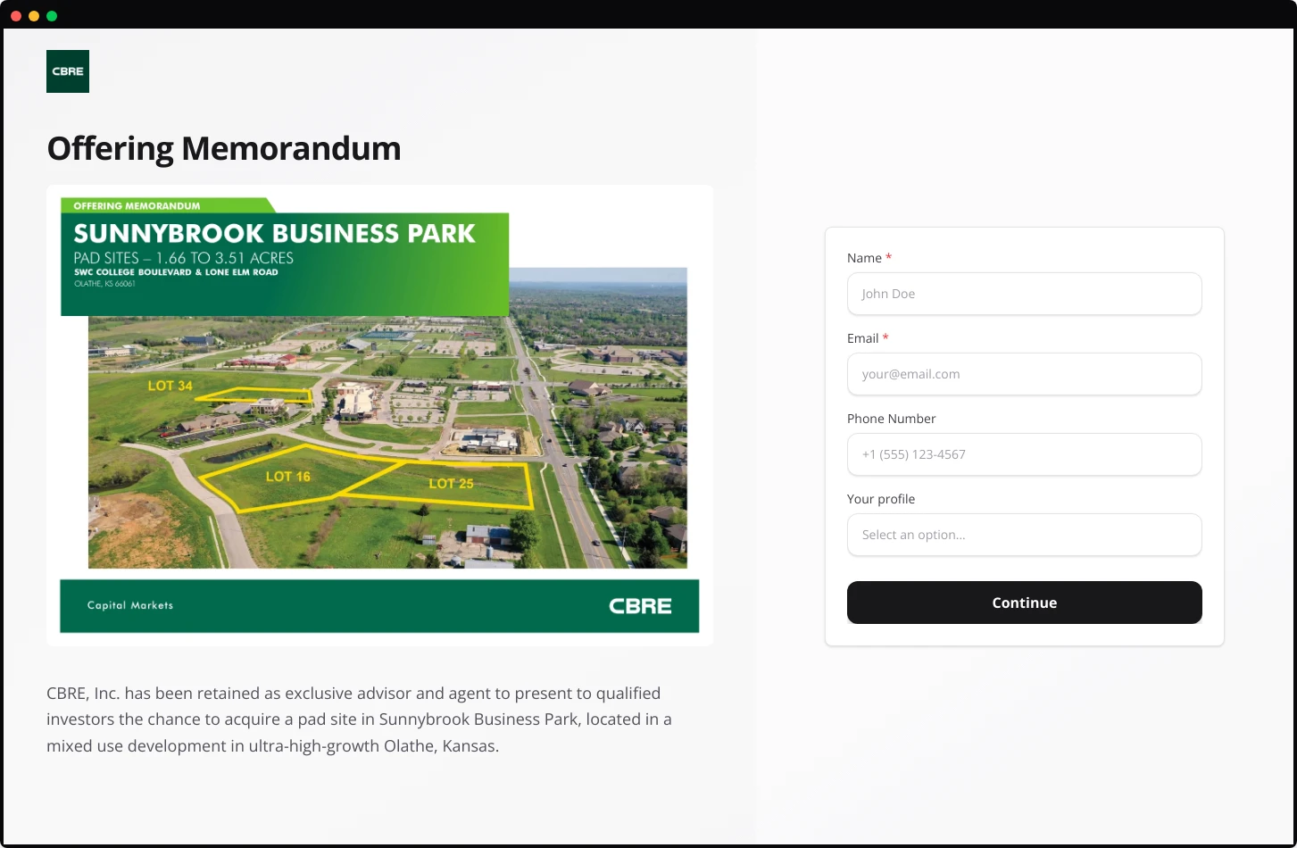
Works best for: Property listings, development projects, or any document where location photography or architectural renderings carry persuasive weight.
Advantages: The hero image creates immediate emotional response. Prospects see the property or product before anything else. The form feels secondary to the content, reducing perceived friction.
Limitations: Mobile responsiveness requires careful handling.
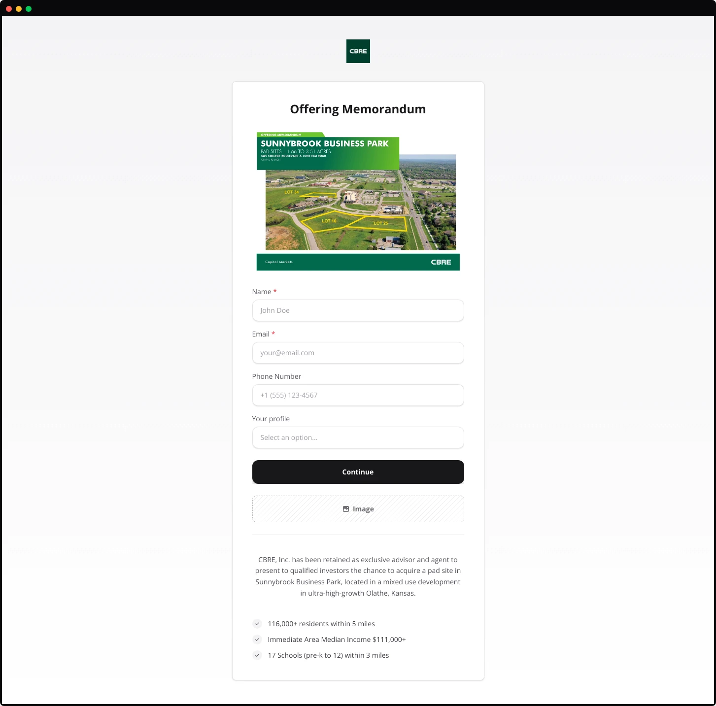
Minimalist
A contained card design centered on the page. Logo, title, document preview, description, and form all sit within a single bordered container against a neutral background.
Works best for: Professional services documents, legal materials, or any context where understated presentation signals credibility.
Advantages: Focuses attention entirely on the content. No visual distractions. Works across all industries and document types.
Limitations: May feel generic without strong branding within the card itself.
Grid Centered
A structured layout with a clear grid pattern. The document title and key selling points appear on the left, with the form occupying the right column.
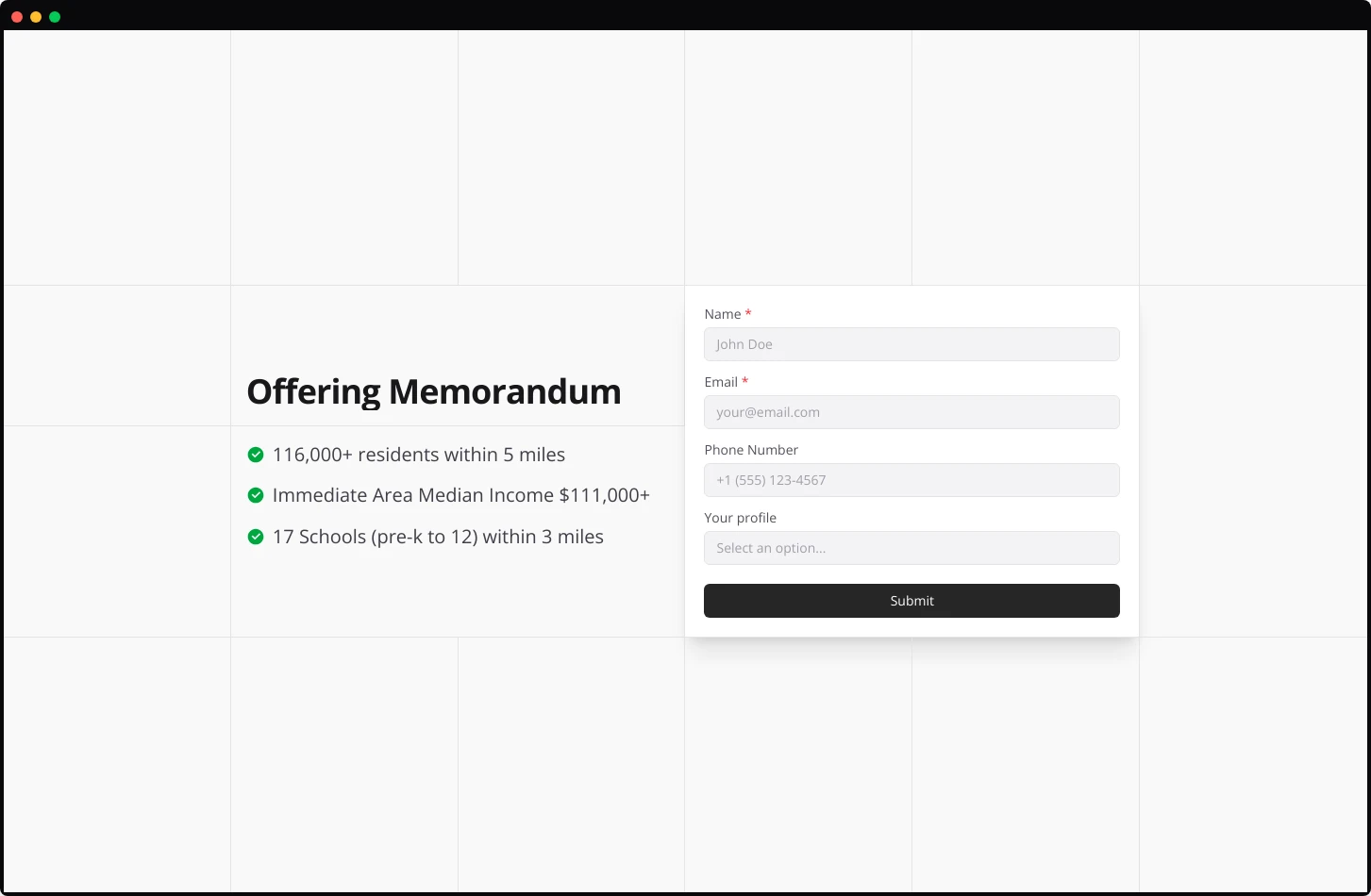
Works best for: Documents with strong bullet-point value propositions, product catalogs, capability statements, or proposals with quantifiable benefits.
Advantages: Clean information hierarchy. Prospects scan the benefits before deciding to fill out the form. The visual balance prevents either element from overwhelming the other.
Limitations: Requires compelling bullet points. No visual information about the brand or the document preview.
Features
A two-column structure with the document image on the left and a content-rich right column. The right side stacks title, description, feature bullet points with icons, then a condensed two-column form, finished with a colored CTA button.
Works best for: Documents with multiple selling points that benefit from visual hierarchy, product sheets, service proposals, or capability presentations.
Advantages: Highest information density while maintaining readability. The icon-enhanced feature list creates scannable value points. Colored CTA button draws the eye to conversion action.
Limitations: Busy layouts risk overwhelming prospects. Only use when your document genuinely has four to five distinct value points worth highlighting.
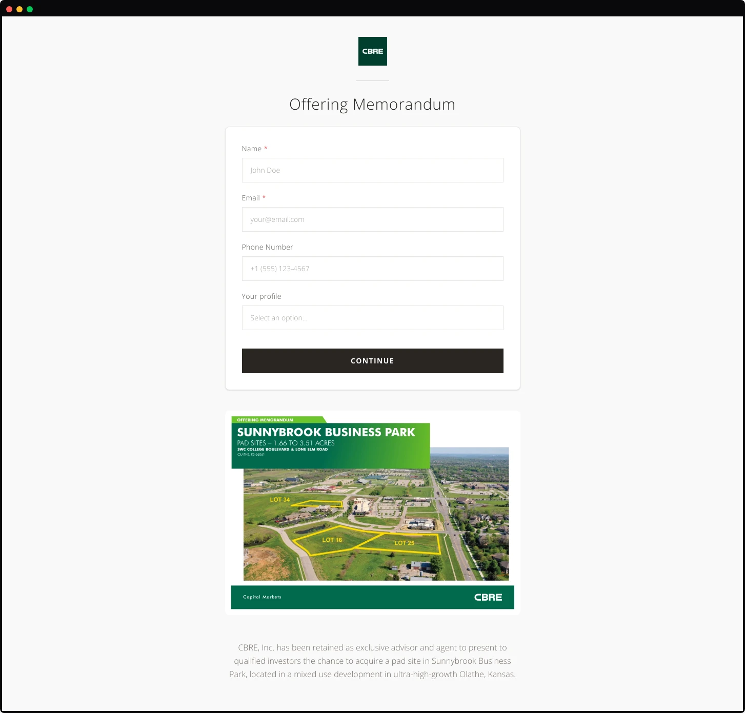
Showcase
A vertically-stacked layout with logo centered at top, followed by title, description, then the document cover image below. Form appears after scrolling on some implementations.
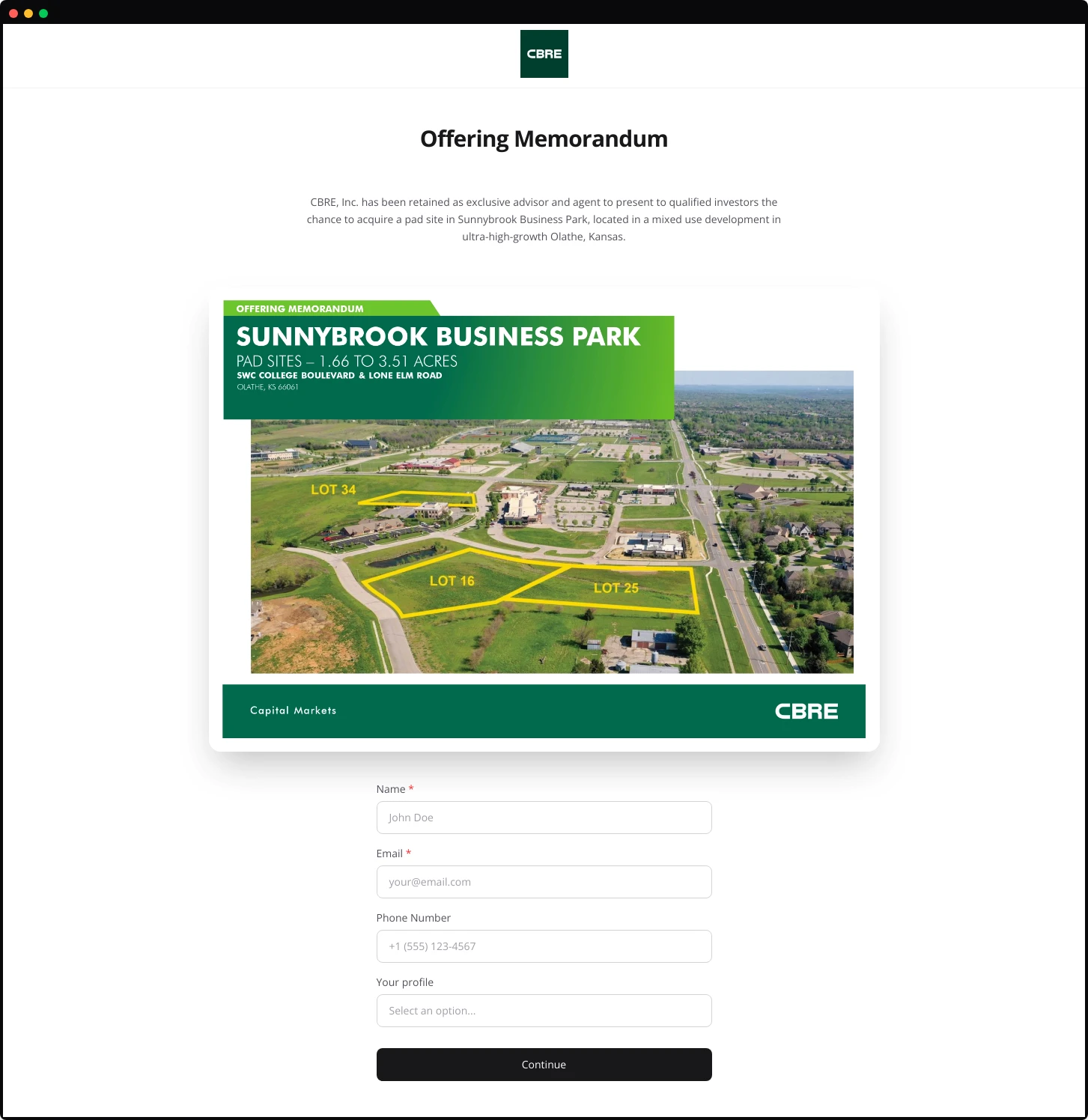
Works best for: Documents meant for detailed review: investment prospectuses, research reports, or comprehensive proposals where the reader expects to commit time.
Advantages: Presentation-style flow guides the eye naturally downward. The large, centered image commands attention without competing with the form.
Limitations: Longer page length may reduce form visibility. Prospects must scroll or commit to reading before seeing the form, potentially reducing conversions.
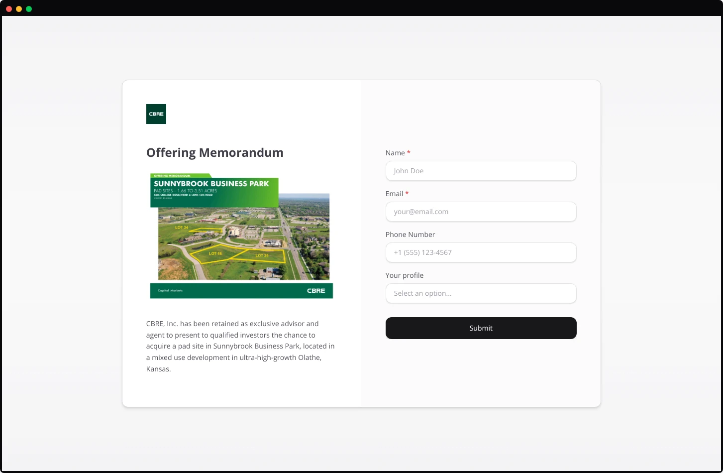
Split Image
A bold two-column design placing the document cover image on the left with full-bleed treatment. The right column contains the title, description, and form.
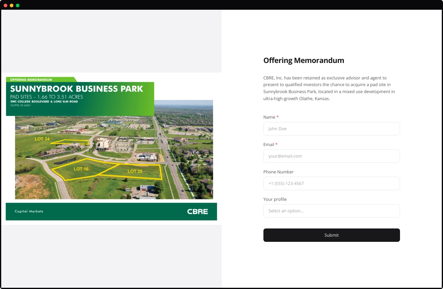
Works best for: Visually striking documents: property offering memorandums, architectural portfolios, or product brochures with strong cover design.
Advantages: Maximum visual impact. The large image format showcases documents with professional photography or design. Creates immediate visual credibility.
Limitations: Demands a high-quality cover image. A mediocre or generic cover looks worse at this scale, not better.